Ogre Codes
Follow @ogre_codes to get notified when new articles are posted to this site.
Good Code Gone Bad
Jul 23, 2017 at 11:10 PM
This is a cautionary note for free software fans. Small software projects, coding tools, and libraries are easy take-over targets and a change of ownership can completely change the motivations of the developers behind the project.
After being hired by Kite, @abe33 made an update to Minimap. The update was titled “Implement Kite promotion,” and it appeared to look at a user’s code and insert links to related pages on Kite’s website. Kite called this a useful feature. Programmers said it was not useful and was therefore just an ad for an unrelated service, something many programmers would consider a violation of the open-source spirit. – How a VC Funded Company is undermining the open-source community
Later Kite purchased/ hired the developer of a plugin for the Atom text editor called python-autocomplete and changed the default code engine to one based on Kite’s own cloud based engine which further angried the community:
Kite’s engine required code be processed on Kite’s cloud server, while the previous version did this work on the user’s machine. This is a crucial difference because sending data to the cloud is a privacy issue, especially given the wide-ranging access permission requested by the tool. Developers said they worried that various scenarios could lead to medical data, payment data, and other data that should be kept private being uploaded to Kite.
Furthermore, many private companies have policies against uploading data to third parties, which would make Kite unusable for developers at those companies.
This serves as a good reminder that putting trust in outside tools and developers is a two edged sword. Kite software sounds a little slimey, but this could just as easily have been outright malicious malware. For tools like this, or libraries we include in code the results could be devastating to our users and our business.
Oh Mai, It’s a Stencil!
Jul 11, 2017 at 5:44 PM
I’ve been using a very good templating engine called “GRMustache” for templates on the blog engine, but I’ve just discovered a new (to me) Swift based template engine called “Stencil” which is modeled after the Django templating engine. I’m sure some people love Mustache templates, but personally I find Django’s template engine to be more expressive and intuitive. Even basic ideas like if logic or for loops are far more expressive in Django. Consider the following short example:
Mustache
{{#people}}
  {{#isEmployee#}}
   <li>{{name}}</li>
  {{/isEmployee}}
{{/people}}
Django Templates/ Stencil
{% for person in people %}
  {% if person.isEmployee %}
    <li>{{ person.name }}</li>
  {% endif %}
{% endfor %}
Anyone can understand the Django template example with a quick scan. The Mustache example is nearly inscrutable even when you understand the basics of how Mustache renders templates. It isn’t even clear if “isEmployee” is a member of people or a global variable.
I’m going to experiment around a bit first, but it’s very likely I’m going to adopt Stencil as the templating engine in favor of the older Mustache based templates.
Pop Up Images
Jul 10, 2017 at 9:48 AM
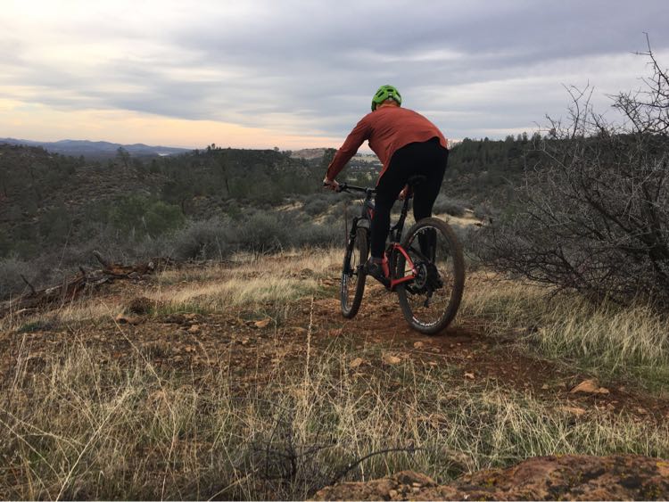
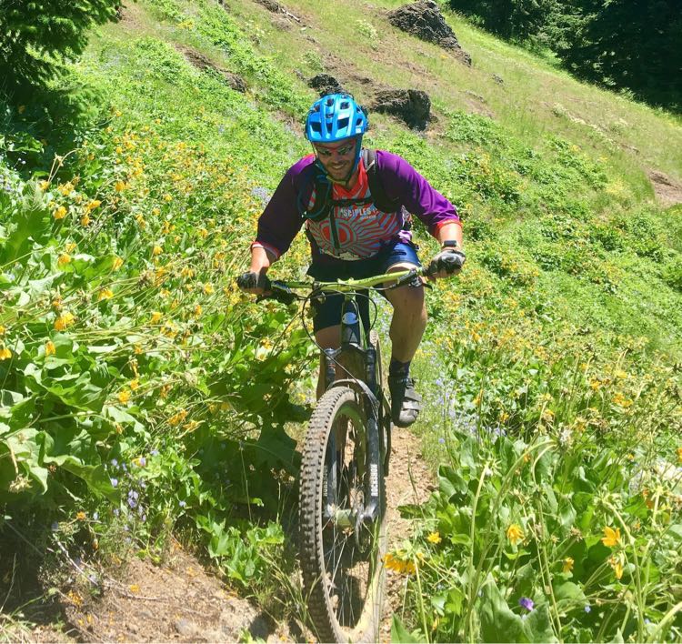
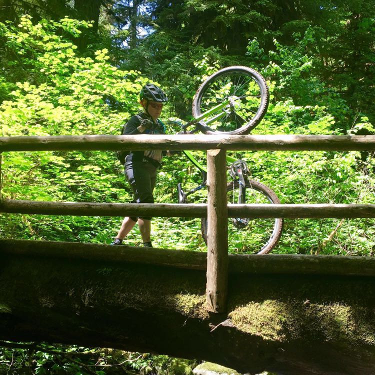
Over the past week I spent a lot of time out enjoying some of my favorite Oregon trails so I hadn’t gotten a chance to finish up the Javascript for pop up images on the blog until yesterday. I’ve done more sophisticated pop-up galleries in the past, but I wanted to keep things simple at this stage. For the moment the app just includes some bone simple jQuery which falls back to a link. To accomplish this, there is a div which covers the whole page and toggle on and off. The div has three images of varying sizes for different screen sizes. The browser’s media query handles the heavy lifting of choosing correct size image to display.
The least code to get the job done
$(".pop-image").on("click", function() {
  if ($(".pop-image-overlay:visible").length>0) {
    $(".pop-image-overlay").hide();
  } else {
    $(this).find(".pop-image-overlay").show();
  }
  return false;
})
The result is a bit more HTML for the various image sizes, but it makes for far simpler Javascript and allows for graceful degradation in the event Javascript is broken or disabled. It also preserves the theme of lightning fast, lightweight pages. I do plan on adding more sophisticated animations and paging later, but right now I’m still pushing to get this app to the “Minimum Viable Product” stage and these animations are low priority.
What I’m a bit more excited about is the new editing tools and Babelfish translator I built to the editor to handle translating from plain text to NSAttributedString to HTML!
Lightning Fast High Quality Images.
Jun 23, 2017 at 11:09 PM
I love photography and I love posting and sharing my photos. So when I started building photo support for the blogging app, I knew I had to pull out the stops when it came to quality. The most common way of doing web images on blogs uses a single thumbnail image and a larger image, but the result is either a low quality non-Retina image or a wastefully large on smaller or low resolution displays. On the modern web, you don’t need to make these compromises, you can present a set of images which are the highest possible quality for the display without wasting bandwidth. This is a brief tutorial on using media queries and the relatively new srcset attribute to deliver lightning fast pages with the highest quality images possible.
CSS Media Queries
The primary tool we’re going to use is the CSS media query. A media query is a simple CSS rule which is only active when specific conditions are met. For example if we wanted to toggle between 3 different resolution images based on display size, we could use a set of media queries like this:
CSS C
    .medium { diplay: none }
    .large { display: none }

    @media (min-width: 576px) {
      .small { display: none }
      .medium { display: block }
    }
    @media (min-width: 968px) {
      .medium { display: none }
      .large { display: block }
     }
HTML
<img class="small" src="hello_320.jpg">
<img class="medium" src="hello_640.jpg">
<img class="large" src="hello_960.jpg">
In the above example, we come at the problem with a mobile first approach, the default is showing a small image for small displays. The @media selectors trigger as the screen size gets bigger and disables the smaller images and shows the larger ones progressively as the display gets larger. In this example, I’ve built out the media queries by hand, but our blogging engine uses Bootstrap which includes a comprehensive set of media queries built specifically for this sort of thing.
By using media queries, we can upload the appropriate sized images for any given display size from a smartphone (sub 576 effective pixels) up to the largest displays and every point between.
The SCRSET attribute
While media queries are an effective way of dealing with multiple screen sizes, the results will be a bit dissapointing if you have a higher resolution display. When Apple released their Retina display, they had a problem; if they rendered pages using the actual resolution of the device, images and layout would be proportionally smaller resulting in tiny images and often broken layout. To work around this, they virtualize the pixels on the page, if a web page requested a 100x100 pixel image, they would render it over a 200x200 pixel area so it appeared the same size. The resulting pages appear closer to what the web page authors intended, but if the original image is 100x100, the result is blurry. The quick and dirty work-around to this problem is provide over-sized images for resources. While this is effective, it results in a lot of wasted bandwidth as clients with lowere resolution displays end up pulling down oversized images. Fortunately there is a better solution to this.
The W3C adopted the srcset attribute which allows you to create multiple alternative resources based on the actual display resolution while preserving a single effective pixel size.
<img src="HelloWorld_360.jpg"
       srcset="HelloWorld_360.jpg 1x,   HelloWorld_720.jpg 2x, HelloWorld_1080.jpg 3x">
Modern web clients will load the 1x, 2x, or 3x image appropriate to the device while older web clients will load the image from the src attribute. The result is your browser loads the highest quality image it’s possible of effectively displaying... which is exactly what we want.
Pulling it all Together

By combining media queries and the SRCSET attribute, we can serve up high quality images which are appropriate for the size and pixel density of the display. In order to do this, we just need to have a series of images on our server of varied sizes. Additionally, we can over-load our sizes, using specific sizes for multiple purposes. For example: a 360 pixel image can be used for a smartphone full sized image and a thumbnail for larger devices; a 720 pixel image can be the 2x image for a smartphone or a medium sized 1x image for a desktop computer; a 1080 pixel image becomes a 3x smartphone image or an extra large 1x image; and so on.
I’ve settled on 5 image sizes from 360 pixels up to 2160 pixels so I have up to 3x resources for smaller displays, 2x resources medium sized displays.
| 1x | 2x | 3x | |
|---|---|---|---|
| Thumb | 360 | 720 | 1080 |
| Small | 720 | 1440 | 2160 |
| Medium | 1080 | 2160 | — |
| Large | 1440 | 2160* | — |
| Extra Large | 2160 | — | — |
| * Not exactly 2x, just use the largest possible size | |||
We’ll use the same images everywhere we have the same resolution so by producing 5 scaled images we have a lot of flexibility in the displays we support. While there is room for additional image sizes, for example a smaller thumbnail size might make sense, we’re very close to the point of diminishing returns with these 5 sizes.
Wrapping it Up
These two techniques form the basis for the image presentation on the site, the next couple of posts I’ll talk about how the app actually renders these tags intelligently from image resources on the iOS device and how to present full scale images when thumbnails are tapped on the web page.
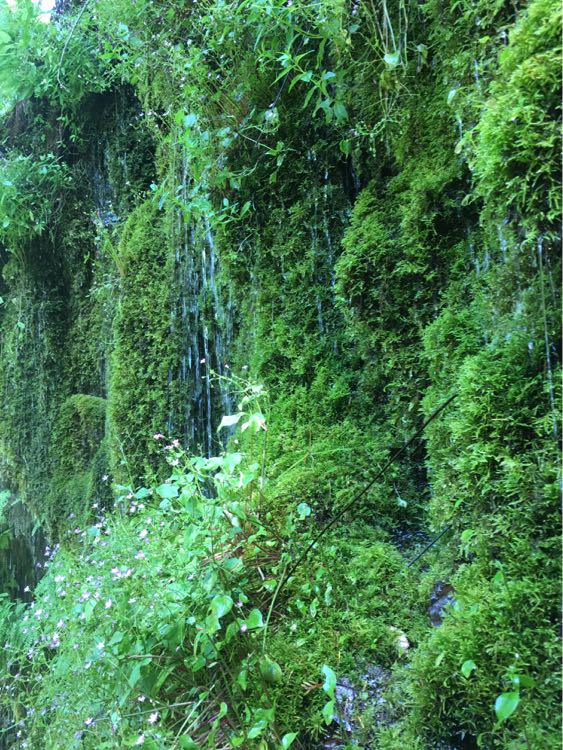
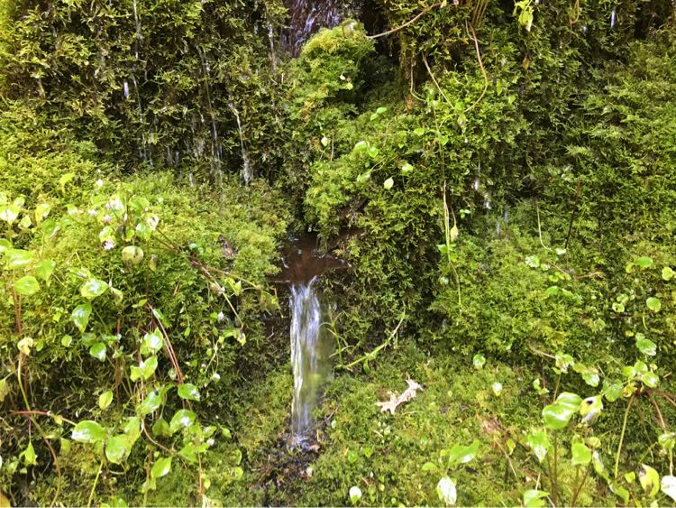
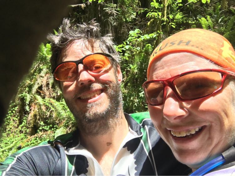
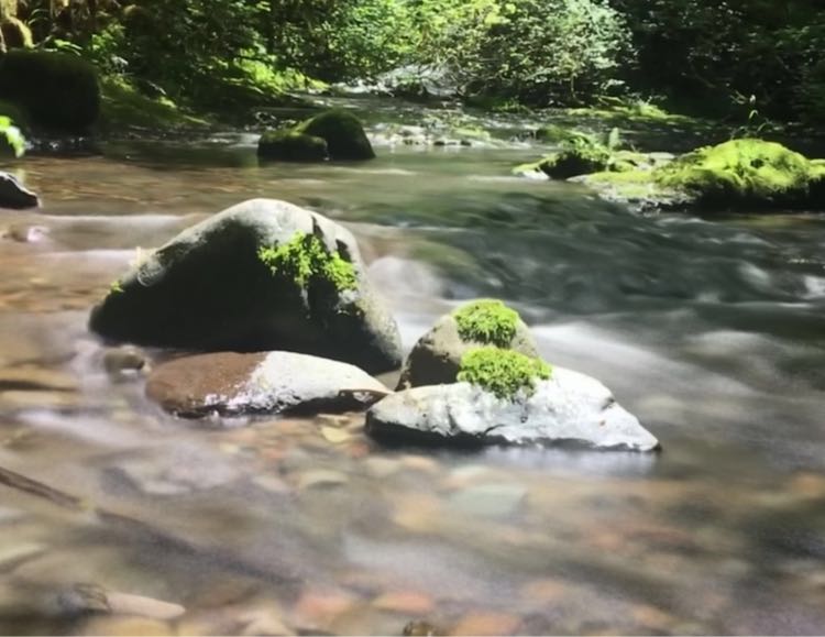
Sample Gallery


Momentum and Focus
Jun 15, 2017 at 10:27 AM
So much going on right now in my life it’s been incredibly hard to find a peaceful place and state of mind where I can be heads down on code. The past week I’ve finally been able to get some time and I’ve made a ton of progress on my blogging app.
I switched the app to use UIDocument and FileWrappers so I could support images and other attachments and possibly iCloud syncronization. Currently images can be selected and saved as part of the document, to add them to the documents, I have to add support to the templates, image scaling, and uploading which I’ll be working on over the next few days.
In addition to switching the document model, I changes the table-views to use iOS’s built in table row update support. Previously I was reloading the entire table every time I updated a row which was quite crude and visually a bit gross. The new method checks if the row has moved and if needed relocates it in the table.
func updateListEntry(_ entry: BlogEntry) {
    // Refresh the view and move the row if needed
    guard let oldRow = entryList.entries.index(of:entry) else {
        fatalError(“Entry is not in the table”)
    }
    entryList.resequence()

    let oldIndex = IndexPath(row:oldRow, section: 0)
    entryTableView.reloadRows(at: [oldIndex], with: .automatic)

    guard let newRow = entryList.entries.index(of:entry) else {
        fatalError(“Entry removed from the table”)
    }

    if oldRow != newRow {
        let newIndex = IndexPath(row:newRow, section: 0)
        entryTableView.moveRow(at: oldIndex, to: newIndex)
    }
}
Making The Switch To Python 3
Apr 19, 2017 at 9:53 PM
I'm finally fully on board with Python 3, and I suspect the majority of the community is too. It's been a long haul, but all of the biggest drags to Python 3 adoption have finally been swept away.
- Most Linux distributions now ship with Python 3 support available and some are working towards using Python 3 as the default Python implementation.
- 339 of the 360 most popular libraries now ship with Python 3 support by default.
- Unicode adoption in general has become more important which puts one of the biggest reasons to migrate to Python 3 at the forefront.
In addition to most of the barriers to switching to Python 3 being removed, there is one rather large reason more and more developers are going to make the switch to Python 3, with the release of Django 2.0 at the end of this year, Django is dropping support for Python 2. The Django team will continue with updates to older versions of Django until 2020, but it would be extremely short sighted to implement a new Django server with Python 2 at this point. Django is responsible for roughly 20% of Python questions on Stack Overflow and is easily the largest Python web framework so this is going to have a rather large impact on the entire community.
To be honest though, the switch is rather underwhelming from a coding perspective. Once you get past the initial environment setup, the language is 99% identical and since most of the libraries are there and Django supports it, the only thing changes are trivial and suddenly unicode support is much better.
If you want to try it out, I've put together a Docker environment for running Django under Python 3 . The installation is straight-forward and you'll be surprised at how straight forward the change is.
Take a look and let me know if you see anything which needs improved.
A Docker Image For Django Development
Apr 2, 2017 at 5:23 PM
Maintaining consistent build environments between multiple development and staging servers can be a chore. Products like Fabric or Ansible work well for managing multiple permanent servers, but don't help much when you are building a test environment development system which requires some kind of VM layer. Docker presents a good solution for this kind of setup. You can build complete environments which are simple to deploy either on a test server or even on a MacBook or other laptop.
A while ago I put together an image for deploying Django with Docker for my team at BiomedGPS and it worked so well I decided I would rebuild it as an open source project. I've released the resulting image on GitHub.com/OgreCodes .
I've tried a few similar images out there, but most of them require you rebuild the image for fairly minor configuration changes. I've set this image up so you should only need to rebuild the image if you need to make changes to the Python environment via requirements.txt. You can deploy a complete Docker image with Django and Nginx serving static and media files, less than 10 minutes. Adding MySQL server instead of SQLLight increases the time by a couple minutes.
The other big thing which makes this image stand out is the step by step instructions on launching the image. If you are familiar with docker and django but have never put together an image, this should be very helpful. Please give it a try and let me know what you think.
If you use Django and you need a straight forward docker container, give it a spin and let me know what you think.
